Your office space speaks volumes about your brand and who you are as a company, and it’s hard to overstate the impact a quality design can have on employees and clients as they enter the space.
While traditional (and perhaps stereotypical) office designs include drab colours and cubicle farms, today’s businesses have begun to master the art of using their space to reflect a real identity, improving morale and productivity.
Make things more open – but don’t go overboard
The biggest problem with the classic cubicle farm wasn’t just the ugliness – it was the lack of interaction among employees.
And while the response to this was typically to make offices completely open, allowing for constant teamwork and communication, the current consensus falls somewhere in the middle.
Even so, if your business fits the criteria for an open floorplan, it’s a great first impression to give clients as this is still generally thought of as a contemporary office design.
Add some flexibility
While it’s important for employees to have their own workstations and privacy, including flexible areas is important as well.
Everyone works differently, so while plenty of employees work just fine from a desk, flexible spaces provide a lot of value in that they give your employees – and you – options.
The great thing about flexible spaces in the office is that they can go pretty much anywhere, allowing you to make the most of awkward leftover spaces that might otherwise go to waste.
As well, giving your employees more options in terms of spaces they can work in allows them to shake things up when they’re starting to slow down from the monotony of their desk or office.
Update your office furniture
Moving on from questions of layout and space, it’s important that the items filling the space have some character as well.
Updating your desks, chairs, and other office furniture allows you to fill your new, modern layout with more contemporary pieces, giving the entire space a much more cohesive identity.
Keeping the furniture that your employees use daily updated also demonstrates to them that you care about them as employees, as you put them in the best possible position to succeed.
And listen to their input, too, especially if you’re updating your existing office space – since you’re replacing things anyway, seek feedback on what they like and don’t like about their current furniture and space.
Add colour – and real artwork
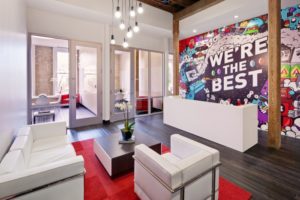
Another mark of a contemporary office space is a bold and bright colour scheme, as opposed to the drab greys and off-whites you might otherwise expect in an office setting.
If you use colour correctly in the office, you can improve employees’ happiness and productivity, as well as giving off different vibes in different spaces such as meeting rooms, reception areas, and workspaces.
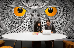
Colours can be applied to the furniture you swap in as well as the walls and floors – but don’t forget to use artwork to add even more flavour to your office space – not just generic posters with inspirational quotes.

Murals, for instance, such as this mural in the boardroom of the social media company Hootsuite, can add life to your office space and also serve more functional purposes, such as splitting up larger spaces.
But whatever you decide on, the colour scheme of your identify is one of the first things people notice as they step into your workspace.
Your brand should have a strong and recognisable identity – and it’s important that your workspace reflects that.
But with just a few improvements, you can spruce up your office space from drab and corporate to bright, lively, and productive.
